How to Design Blog Graphics That Convert
It's no secret I'm always talking about Pinterest and how it's my secret weapon in business. To put it simply, it is an INCREDIBLE marketing platform that has the power to grow your site's traffic, email list, and audience... all on autopilot.
Think of Pinterest like Google... above all else, Pinterest is one giant search engine.
The part I love so much about Pinterest is how visual it is. I mean, it's just so dang pretty... right?!
Which means that if you aren't creating beautiful and strategic graphics for your blog, then it will dull your performance on Pinterest. Aka... it ain't visually appealing... no one will pin it.
In order to create a high-converting blog post image that will get pinned and re-pinned over and over and over again, landing you tons of website traffic, is so much more than a pretty picture or fancy fonts.
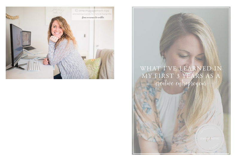
Here's an example of what my graphics USED to look like:
The left one is cute, but it's the wrong size, you can't see the text and no one scrolling through Pinterest would stop to see what it is about. The right image is an upgrade from the left, but still difficult to read.
How to create graphics that convert:
01. Graphic should have Large and easy-to-read text.
In the example above, you'll see that I did not do this on the left, but I did improve this on the right image! When people are scrolling through their Pinterest feed, they’re not taking time to read every single description. They want to know exactly what they’ll get out of your blog post at first glance. By adding a large title on your image, you’re showing people the value that you’re giving away in your post, and enticing them to click through or re-pin it.
02. horizontal vs. vertical
Like the before and after, vertical always wins on Pinterest! I recommend 600x900 pixels for your blog graphic size. Having vertical images with the text on top is critical to getting more traffic to your website from Pinterest.
03. Keep it on brand.
My brand has gone through some changes over the years, even recently! More on that project here...
Anyway, I was trying to do ALL THE THINGS in my first few years as an entrepreneur because I just didn't know for sure yet what my focus was. It was always photography, but things have evolved since then. It's important over time (or sooner!) to hone in on your brand's identity.
04. Include your link.
You'll see my newly updated graphic at the top of this post with a link to my website at the bottom. I also put my business name right at the top. I want people scrolling Pinterest to recognize my graphic (it will take time since I just rebranded) but I do want it to eventually be familiar.
05. make sure your images are seo ready.
What does this mean? Title all your images, especially your blog graphic! It's good practice for SEO to make sure EVERY single image on your website is titled and SEO ready. Keywords are huge with Pinterest and getting your blog posts discovered.
It's simple: instead of naming your blog post images something like “101_01.JPG,” you should include keywords in the image name itself. Keywords are words or a phrase that someone may be searching for (on Google or Pinterest) in order to find your blog post or graphic. I've included a screen shot of what it would look like if someone pinned my graphic in this post to Pinterest. It's filled with rich keywords relevant to the topic and my business.
06. your post needs to be evergreen.
I learned this concept in a course I took, which talks all about Evergreen content. Basically, evergreen content is information that will still be relevant one year or ten years down the road. Pinterest is not the place for time sensitive information like a one time webinar you're hosting or event. Pinterest is looking for content that is valuable for all time.
I've discovered that pins I've pinned over a year ago are just now making waves and being shared like crazy. This is the beauty of Pinterest, like Google, old content can quickly become popular.
07. Include opt-in incentives!
If applicable, add a freebie opt in to your blog post (and graphic!) You'll see one here on this post to invite my readers (YOU) to download a free copy of my own graphic template. Obviously you will not use mine exactly as you'll want to change the fonts, colors, etc. to match your own brand but it's a great foundation to help you get started!
It means that if you have some sort of incentive for people to join your list (a free worksheet, email course, PDF download, etc), then you should put it right on top of your Pinterest image or below the text so that it’s immediately evident that someone will be able to get a valuable freebie if they click through to your post.
IF YOU ENJOYED THIS POST, YOU MIGHT ALSO LIKE:
Why it might be time to consider hiring a website designer


